Three towers named after three queens: Wilhelmina, Juliana and Beatrix.
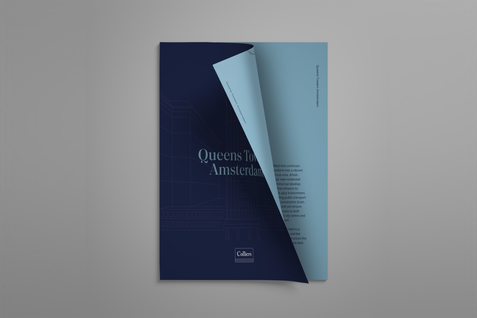
For Colliers, we designed the investment memorandum for Queens Towers Amsterdam, an iconic office complex on the Amsterdam West Axis. We also designed a small logo, inspired by the distinctive rooftops of the three towers.
The photography was supplied, but we colour-graded every image so that it fits our colour palette perfectly. The maps, charts and floor plans were made by us.


We chose a bold colour combination of deep navy, burnt orange and soft sky blue, and colour-graded all of the supplied photography to match it, so every image feels part of the same story.
A classic serif typeface gives the memorandum a stately, royal tone, while the layout itself stays playful and unique: oversized statements, unexpected crops and the three little rooftops of the logo returning on every spread.