
One studio for everything A1 Vastgoed puts out into the world.
A1 Vastgoed invests its own capital in commercial retail real estate: visible, well-located shops in the busiest high streets of the Netherlands. For A1 Vastgoed, Studio-073 is a one-stop shop, from the brand identity and website to investment memoranda and window graphics.
We also shoot all their photography, from the properties they own to the portfolio on their website, and create every illustration. Alongside that, we design the everyday brand touchpoints: email signatures, one-pagers for retail units to let, several window graphics and a range of other graphic design.
Their existing identity was neat but formal. It felt more like a bank vault or a notary’s office than a company known for short lines and direct contact. The brief: make the brand warmer and more personal, keep the logo and the gold and dark teal, and don’t be too cautious.


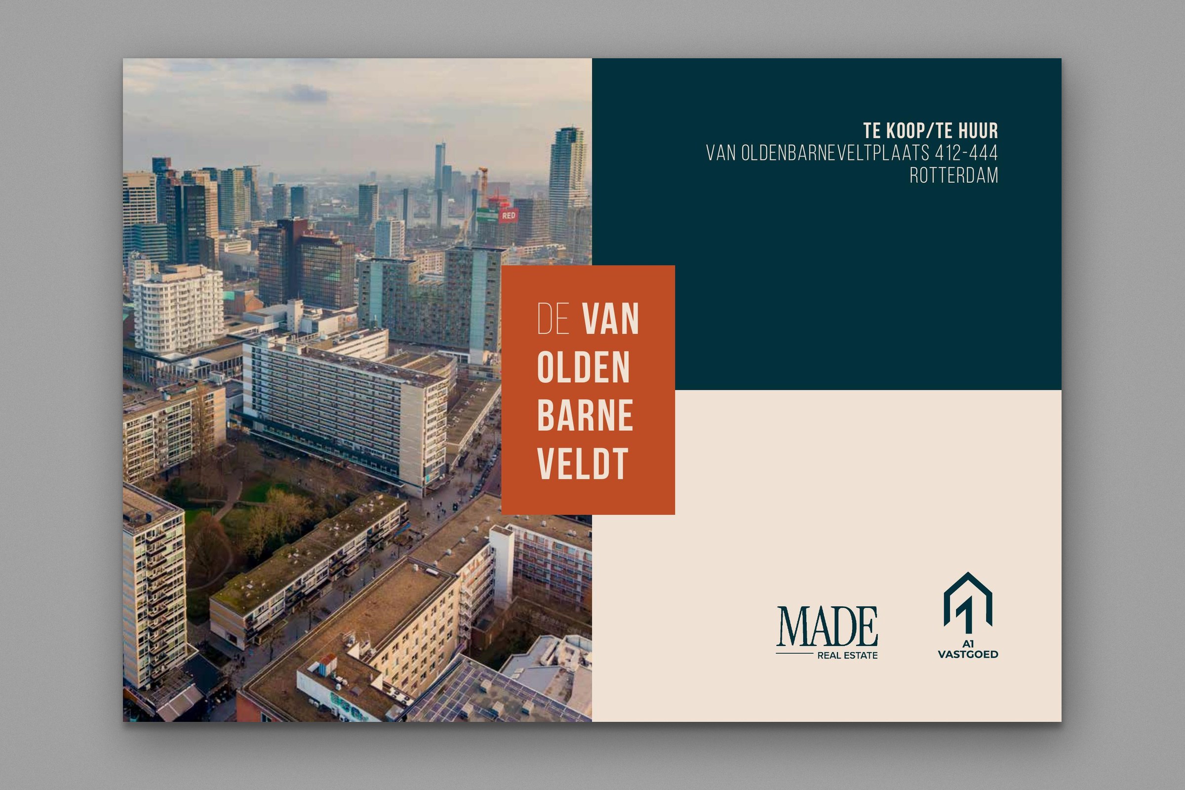


One of several window graphics we designed for A1 Vastgoed: turning a vacant retail unit into an invitation to look inside.

The new tone of voice is warm, friendly and human. The logo and the primary colours stayed: dark teal for trust, calm and stability, gold for quality, success and warmth.
Around them we built a palette of secondary colours, each with its own role. Copper brings energy and makes things stand out, blush feels soft and empathetic, and bronze feels earthy and inviting. Pine and sage add balance and a natural touch, and nude is the calm base that holds it all together. Together they reflect who A1 Vastgoed is as a company: approachable, personal and easy to talk to.
Creativity is a uniquely human quality, and our illustrations translate it into a personal touch. They give the brand a recognisable character without relying on photography alone, and make the identity truly distinctive. Photography of crowded shopping streets brings movement, and our photography of the properties and the team portraits shows the real buildings and the people behind them.